“Mapping is a powerful tool to tell stories of social, cultural, and political phenomena,” says Zhao, an assistant professor of geography who specializes in the social implications of maps and using innovative methods in mapping. “As a geographer, and in what people call the ‘post-truth era,’ it’s important to weigh in with data sources to show people how things are happening.”

The outbreak of the coronavirus has been declared a public health emergency by the WHO. More than 114,000 people have been infected worldwide, and more than 4,000 have died.*
More Stories
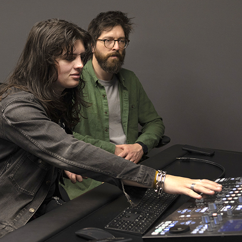
Pairing Music & Technology
With its Music and Technology program, the School of Music provides a foundation in music recording and experience in a recording studio.
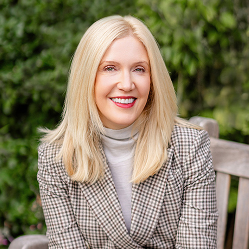
Nicole McNichols Wants to Improve Your Love Life
In her new book, "You Could Be Having Better Sex," psychology professor Nicole McNichols shares frank information based on academic research.

AI in the Classroom? For Faculty, It's Complicated
Three College of Arts & Sciences professors discuss the impact of AI on their teaching and on student learning. The consensus? It’s complicated.